If you are new photography, you might not have a definitive style yet and that’s ok! Style is something that develops over time and constantly evolves. Recently I made the decision to add warmer tones to all my photos. As an artist, I think it is extra important to stay open, experiment, and try new things.
Despite this, I suggest to try as much as possible to keep photos consistent and let evolution happen over time.
By consistent I mean two basic things: 1. Keep crop dimension the same for a set of photos, and 2. Stick to similar color tones.
1. Crop Dimension
This one is pretty straight forward. If one of your photos is 4×6, they should all be locked into that dimension. If they are 4×4 square with white borders, they should all be square with white borders. For something like wedding and portrait photography, I would recommend using standard dimensions like 4×6 or 8×10. It’s easier if your client decides to print.
2. Presets and Color Tones
Nowadays there are thousands of Photoshop and LightRoom presets that make photo effects easy to do. If you aren’t familiar with presets, they are like the iPhone Apps Instagram that put your photos through color filters with one push of a button.
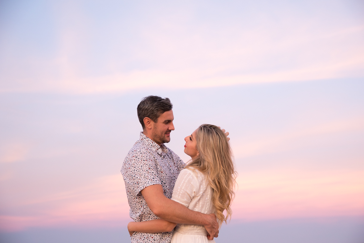
They are really neat but my advice would be to go easy on them. Do you have a favorite preset that you like to use? Pick your favorite two and stick to using those instead of jumping around and making every photo look different. This is especially important in a given set/series of photos. The pictures might look fine individually but if you put them together, say for a blog or photo album, the different color tones can clash and your work will look inconsistent. Here are a couple examples:
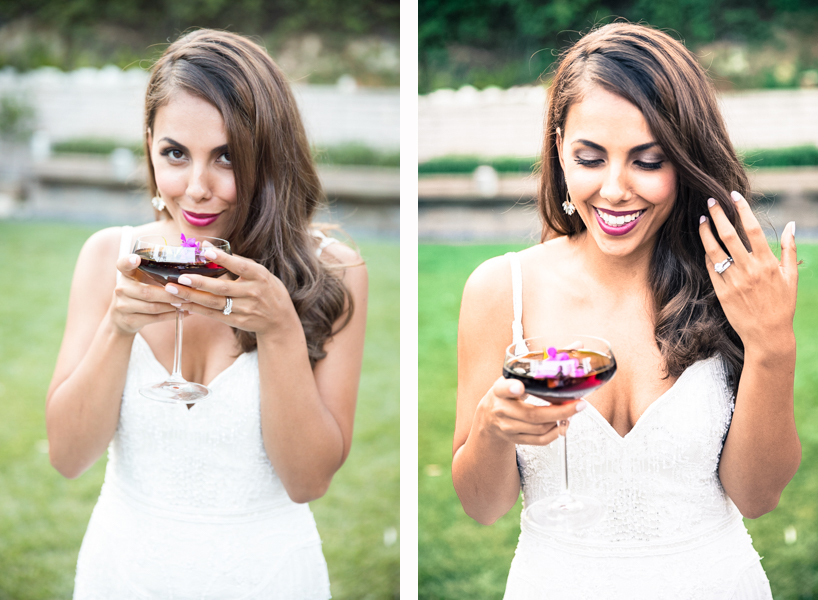
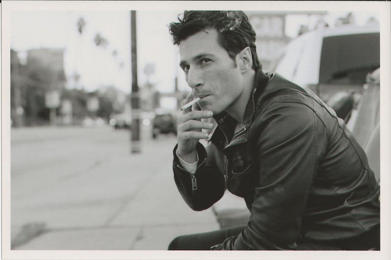
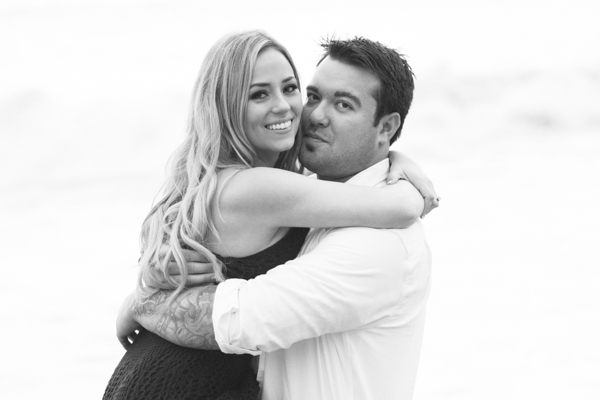
See how B&W can have very different tones too? Whatever you choose, I would do the same effect to all the photos in that given set. So for the pictures of the bride in front of greenery, if I want to make colors “punchy” and really pop, I would stick to doing that for all her pictures. If I want natural, I would do that for all her pictures. (In case you are wondering, I tend to go for natural color tones because I feel they are the most timeless).
Of course, there are never any rules and it’s not something to religiously stick to. You should do what you feel looks good for your particular shoot. Trust your gut.
Something to remember:
Presets do not cure all. In most cases, just because you run your picture through a filter doesn’t automatically make them pretty.
All photographers shoot differently (different camera, lenses, settings, lighting) and the same filter used on one photo won’t look necessarily work for another. Therefore it is important that after you use a preset, look at your picture and make any adjustments according to your preference. Presets are a GREAT place to start to get color tones you like but they always require adjustments to make them your own.

As someone who doesn’t know a thing about edited this was so helpful! What lovely photos of a gorgeous couple, too!
I have been taking pictures and editing them as my hobby for years now. But I only recently realized that keeping my photos consistent is very important. I learned a lot from your blog. Thank you!
You ought to take part in a contest for one of the finest blogs on the web.
I will recommend this blog!
This design is incredible! You most certainly know how to
keep a reader entertained. Between your wit and your videos, I was almost moved
to start my own blog (well, almost…HaHa!) Great job. I really
loved what you had to say, and more than that, how
you presented it. Too cool!
I’m definitely loving the information.
By changing the color tone a bit and by adjusting the brightness/contrast the whole scene can be transformed. And I guess for doing this basic editing much knowledge may not be needed.
I understand that every photographer have their own unique tone style hence they’re consistent on their photos but won’t it be weird if for different theme photoshoot (like Halloween) we use the same bright tone?
That is a great point. I think you can still have the same editing effects, but the mood of the photos will obviously be different because of the subjects. i.e. the Halloween backdrop most likely wouldn’t be a bright rainbow color. And if going for more moody, I also would not take a Halloween photo while the sun is shining bright. 🙂
First of all appreciate your photography and then thanks for sharing it.Some great moments are captured that provides more happiness to people mind.
Very good color tone.Black and white is really great.
I absolutely love this article! This is exactly what I’ve been looking for. I’ve been thinking for some time now that I need to make my photos more consistent for my Instagram and blog feeds and considered presets and filters as a way of doing so but I always want to make every photo look the best individually. Thanks for the tips and for the reassurance! Cheers!
Wonderful, what a blog it is! This webpage provides useful data to us, keep it up.
Hi.
Many many thanks for sharing such a superclass tips. Wonderful explanation and I really appreciate your tips. keep posting such kind of information on your page.
I will certainly dig it and personally suggest to my friends. I’m sure they’ll be benefited from this website.
Great post! I am actually getting ready to across this information, It’s very helpful for this blog.Also great with all of the valuable information you have Keep up the good work you are doing well.
Wow, pretty cool tips. I really appreciate your post. I definitely visit this blog again
So much thanks for the sharing. I was looking for that and this is very important for me. Thanks! I thoroughly appreciated your post!